Taking one new fractional client from OctoberBook a 30-minute call

Polygon Nightfall
Block Explorer

Nightfall is a privacy rollup co-developed by EY and Polygon. Enterprises using it still need to see what's happening on-chain — so I designed a block explorer for a network whose whole point is not showing everything. Zero to tested prototype in four weeks.

Role

Product Designer

Year

2022

Timeline

4 weeks
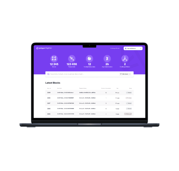
Polygon Nightfall block explorer shown on a tablet

Show the network, hide the people

Nightfall is an optimistic rollup for companies that can’t let competitors read their ledger. The explorer had to prove the network works without exposing who uses it, so deciding what not to show was half the design. I mapped eight explorers first. All of them covered blocks and transactions. None had a place for what an optimistic rollup runs on: blocks that can be challenged, and the proposers who stake on them.
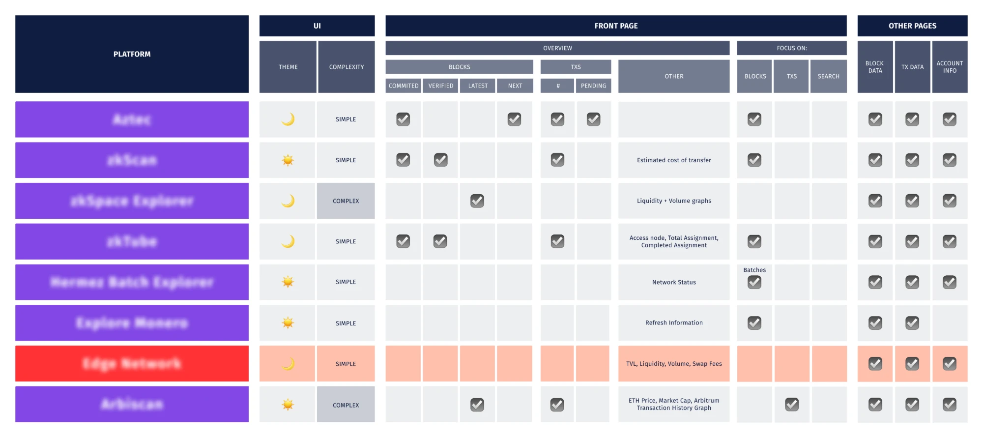
Competitor analysis — eight block explorers compared on theme, complexity, what the front page shows, and which detail pages exist. Block and transaction pages are universal; none has a page for challenged blocks or proposers.

One workshop, five pages

One session with the Nightfall team: who uses an explorer and why, what the competitors do, then seventy minutes of sketching. We left with five pages on paper — front page, block, transaction, challenged blocks, proposer — and a list of what each would refuse to show.
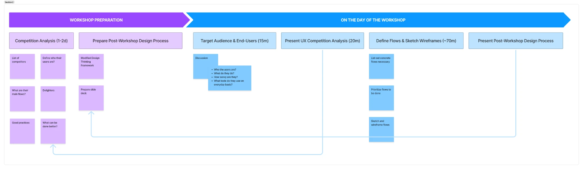
The workshop plan — preparation (competition analysis over one to two days, and the post-workshop design process), then the day itself: target audience and end users for 15 minutes, the UX competition analysis for 20, defining flows and sketching wireframes for about 70, and presenting the design process that follows
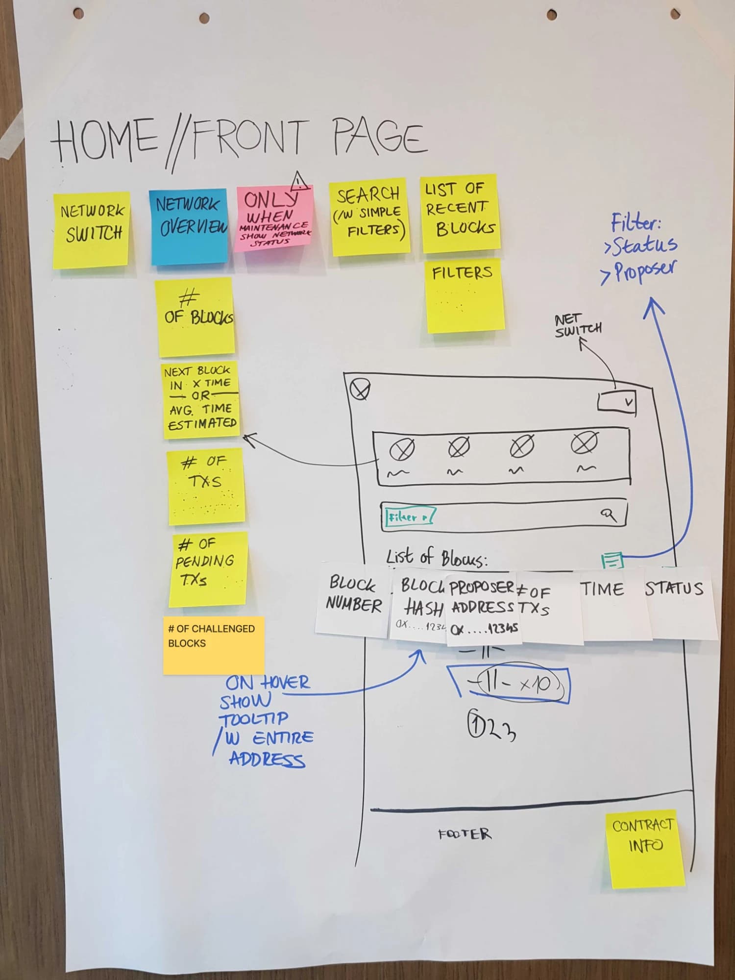
Workshop sketch of the front page — sticky notes for the network switch, network overview, search and the list of recent blocks, beside a wireframe of the page with the block table columns taped across it
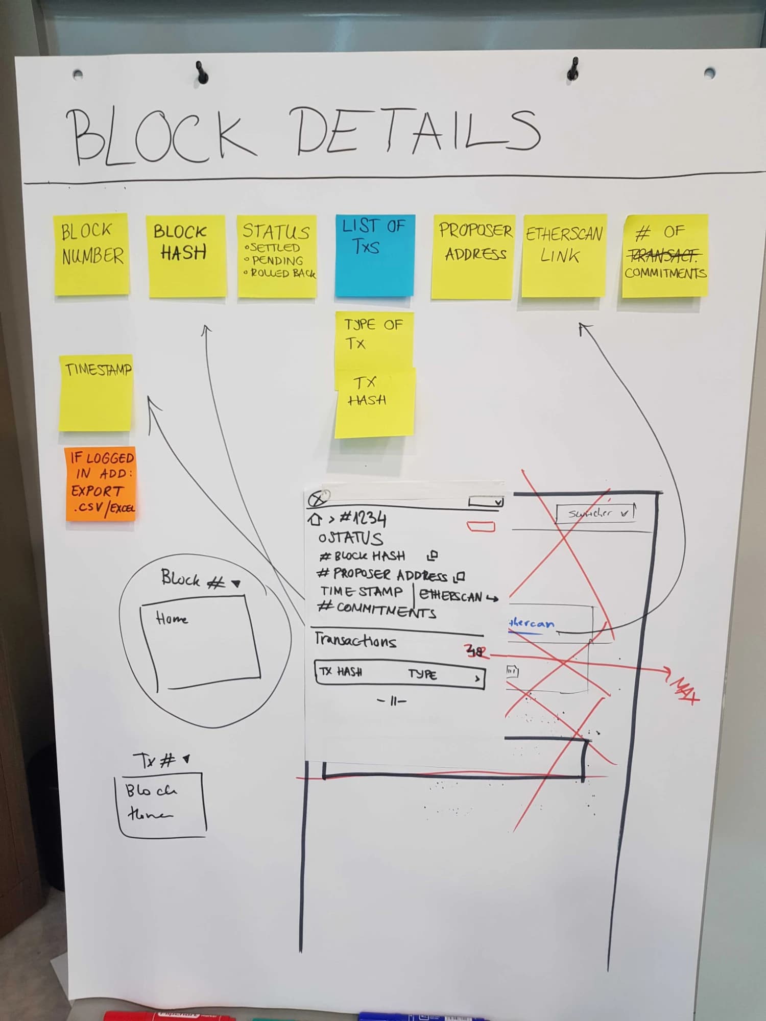
Workshop sketch of the block details page — sticky notes for block number, hash, status (settled, pending, rolled back), the list of transactions, proposer address, Etherscan link and number of commitments, with an orange note that exports wait for a login, and a wireframe of the page with an earlier layout crossed out in red
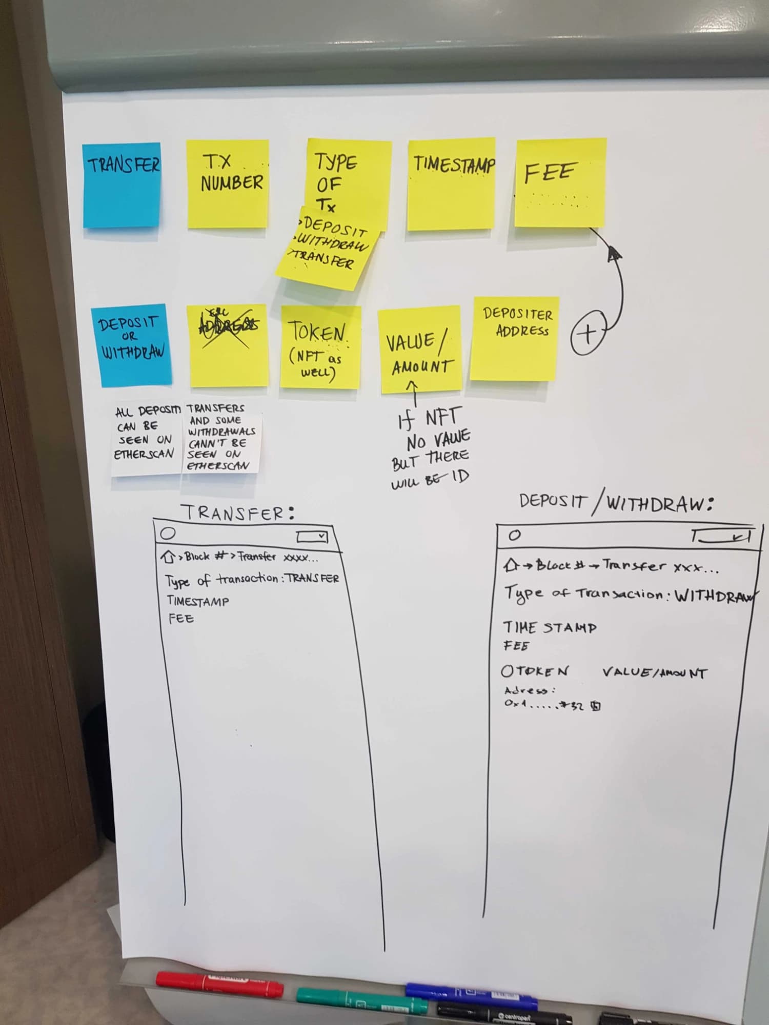
Workshop sketch of the transaction page — sticky notes for type, timestamp, fee, token and amount, a note that NFTs get an ID but no value, and two wireframes side by side: a transfer showing only type, timestamp and fee, and a deposit or withdrawal that adds token, amount and address
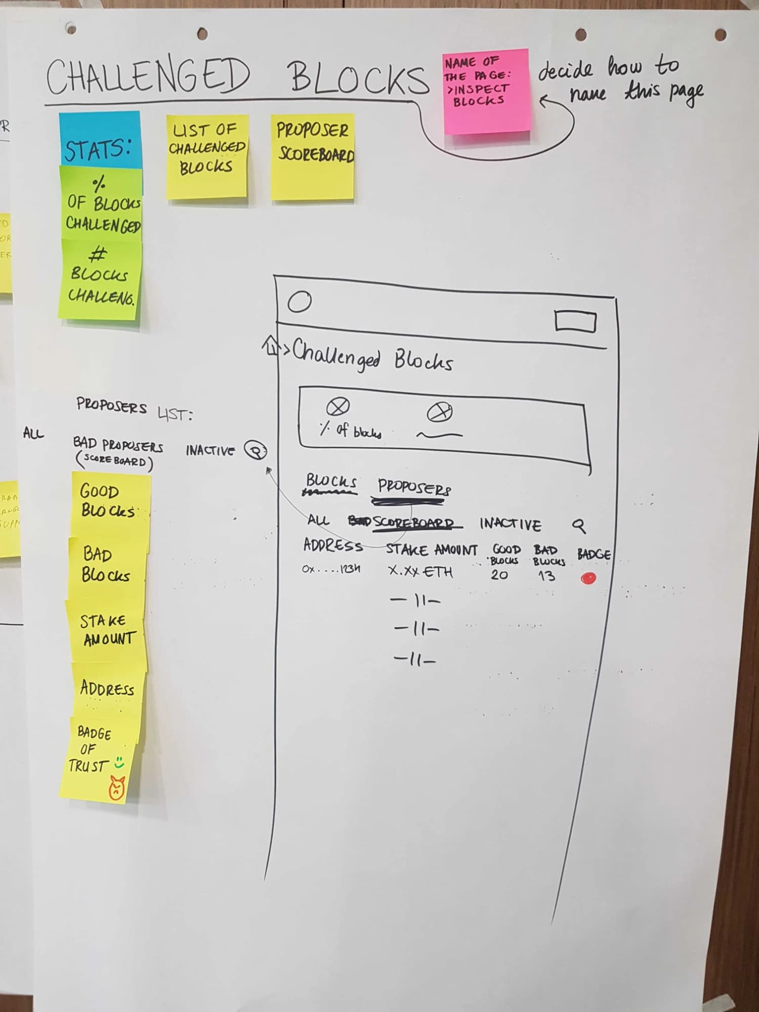
Workshop sketch of the challenged blocks page — stats on how many blocks were challenged, a proposer scoreboard of good blocks, bad blocks, stake and a badge of trust, and a pink sticky note beside the title: decide how to name this page
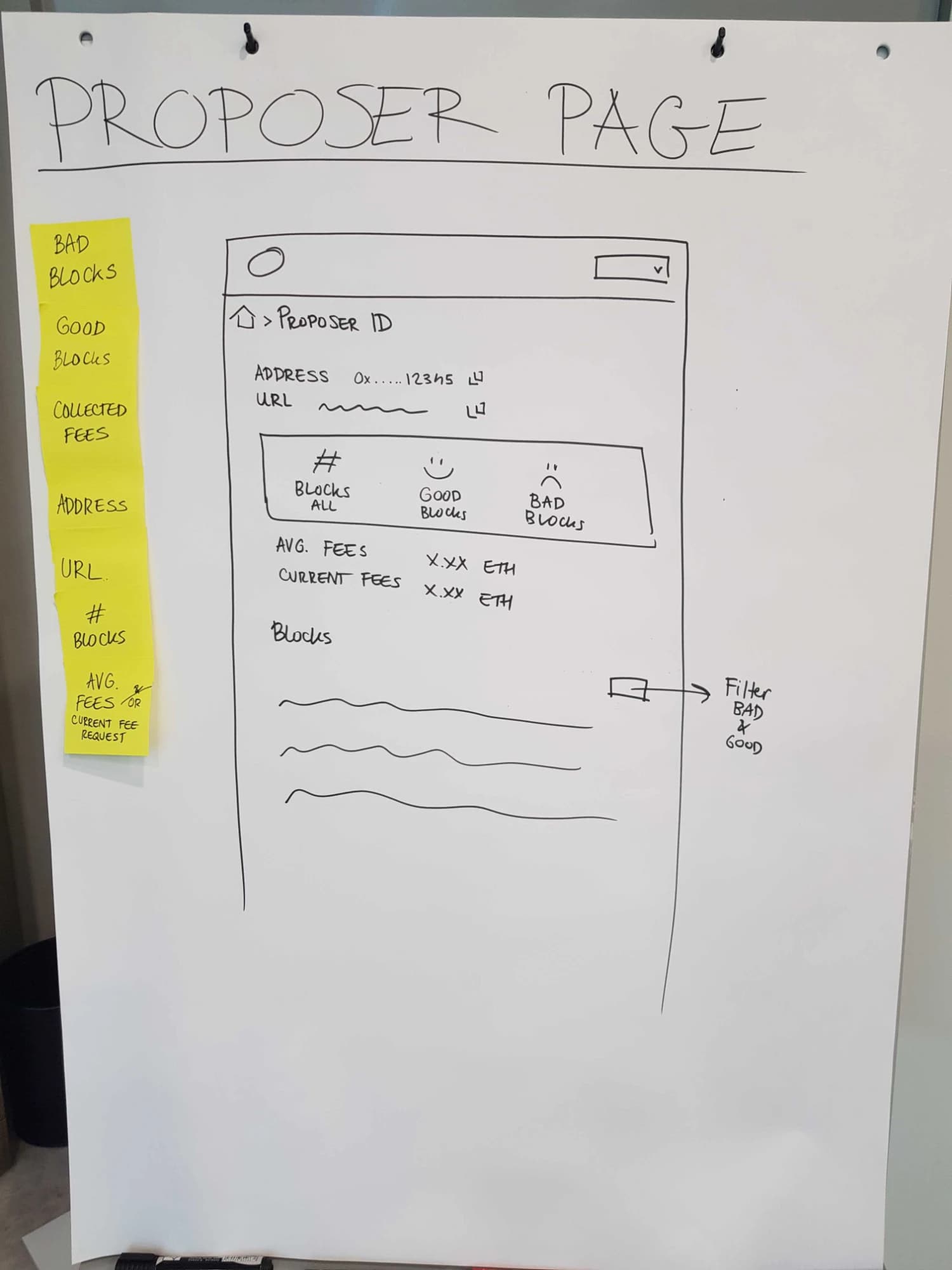
Workshop sketch of the proposer page — sticky notes for good blocks, bad blocks, collected fees, address and URL, beside a wireframe with the proposer ID, a stats box of all, good and bad blocks, average and current fees, and a block list filtered by good and bad

What privacy looks like on a screen

Deposits and withdrawals touch Ethereum, so they’re public anyway — the explorer shows them in full and links to Etherscan. Transfers inside Nightfall are the private part: you see that one happened, when, and the fee — not how much moved. NFTs get an ID, never a value.

The rule: show what proves the network works, hide what belongs to the people using it.
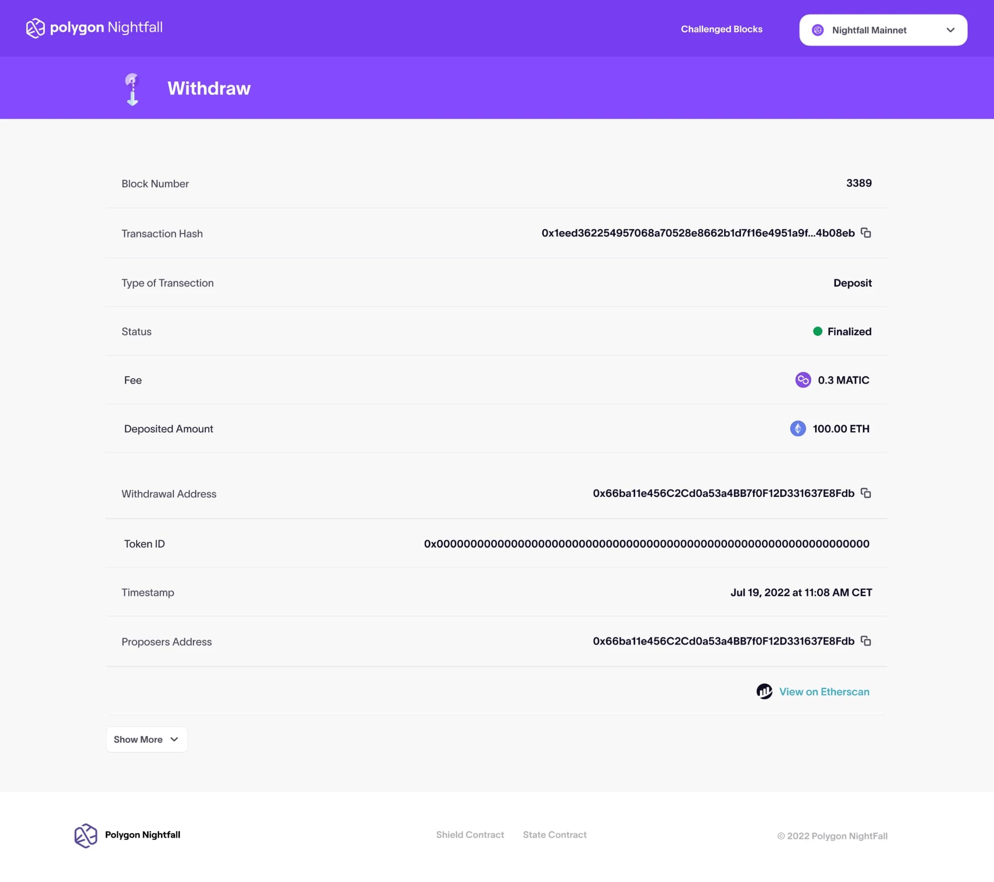
Prototype of a deposit in the explorer — block number, transaction hash, type, a finalized status, a 0.3 MATIC fee and the deposited amount of 100 ETH shown in full, with the addresses, token ID, timestamp and a link to view it on Etherscan
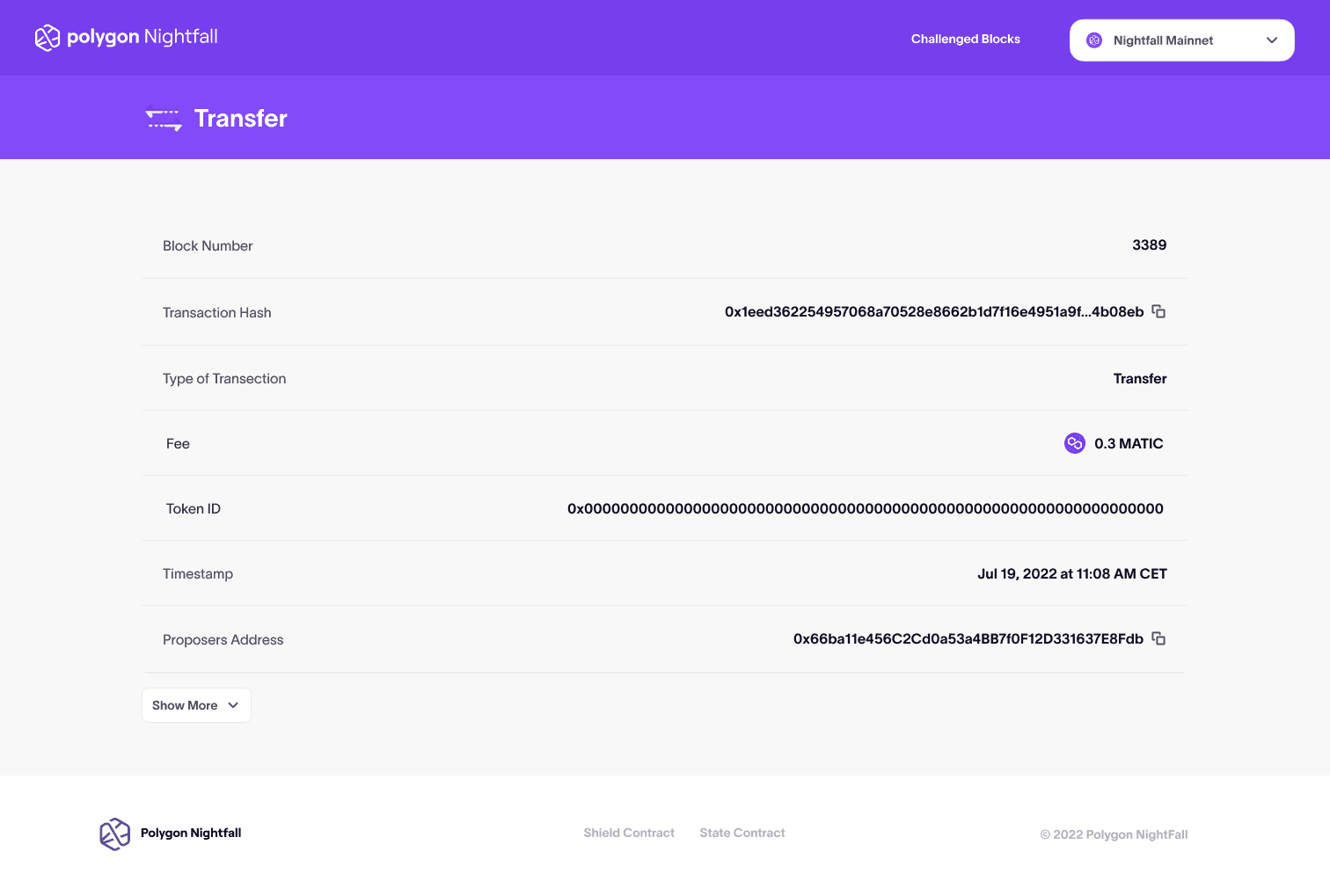
Prototype of a transfer in the explorer — block number, transaction hash, type, fee, token ID, timestamp and proposer address, with no amount anywhere on the page

Pages no other explorer had

Challenged blocks: how many were disputed, which ones, who challenged, and who was right. Even the name was a decision — the sketch still carries the sticky note that says so. The proposer page turns good blocks, bad blocks, and stake into a track record anyone can judge.

Prototype of the challenged blocks page — the share and number of challenged blocks across the top, and a scoreboard of proposers ranked by good blocks, bad blocks and stake, with tabs for challenged blocks and proposers
Prototype of the proposer page — the proposer URL, address and current fee, a row of totals for blocks, good blocks, bad blocks and currently challenged blocks, and the proposer's block list filtered by all, good and bad

Scope: no login, first

Exports, tracked accounts, anything behind a login waited for version two. Three weeks were enough for one thing done properly: a public explorer, prototyped and tested. When the design system arrived late, I built from wireframe components and moved the schedule, not the scope.
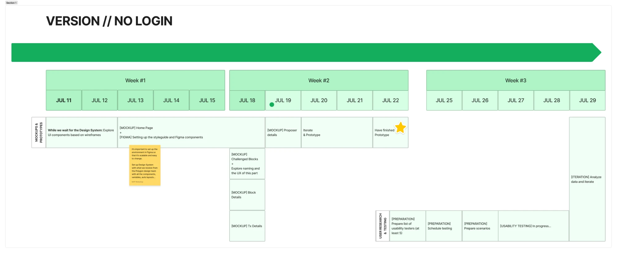
The three-week plan for the no-login version — mockups and prototypes on top, from exploring UI components while waiting for the design system to a finished prototype by July 22, and user research and testing below, from recruiting at least five testers to usability testing and iteration

Tested before it shipped

Five 30-minute think-aloud sessions on a Figma prototype, with people from the Nightfall team. Three tasks: find network stats, check a deposit’s status, look up a proposer.

  1. Tester after tester looked for a search button; the bare input read as a filter.
  2. Transaction status wasn’t seen at first glance — people scanned the list instead.
  3. “Are these L1 or L2 blocks?” came up unprompted more than once.
  4. One timestamp raised a question: time of deposit, or time of block?
  5. Fees in ETH and MATIC read as one number; nobody could say what “average fee” averaged.
  6. “Settled” meant little even to people who work on the network.
  7. The proposer page was hard to reach.

Testers also disagreed. One wanted the proposer address on every transaction, another said it didn’t belong there. One wanted the orange pending state gone, because it looked like a network fault.
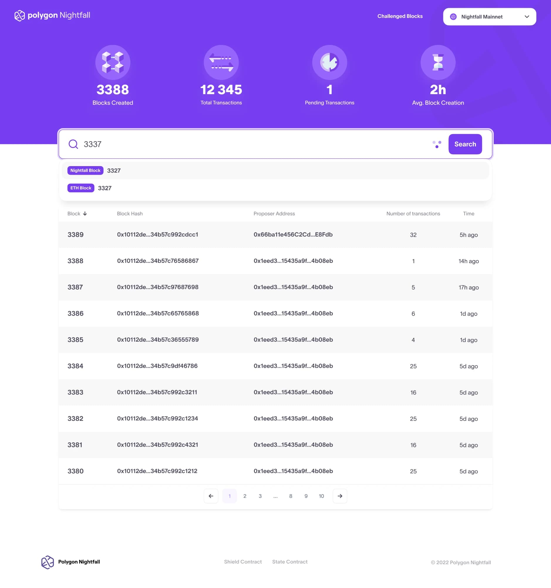
Prototype of the front page mid-search — network stats across the top, the search bar with its own Search button, and the results labelled Nightfall Block and ETH Block above the latest blocks table

What the test couldn't tell me

The testers were network insiders, not end users. They catch vocabulary and structure; they won’t catch what a first-time visitor misses. Next I’d test with people outside the team and score task completion instead of collecting quotes.

Working on something complex?